Harper sent me the galleys for the book. For those not familiar with the nomenclature of the publishing industry, galleys are basically what the book is going to look like – subject to further proofreading and minor tweakage. And the actual book will be hardcover. Galleys get sent to reviewers and book buyers and folks they’d like to get endorsement blurbs from. They’re much more official looking than a photocopied manuscript and eminently more portable.
I wasn’t sure why they called them galleys in the first place so I looked it up and found the word is derived from the French gallée which is a long tray for holding the set-up type. Discovering that fact wasn’t as interesting as I’d imagined.
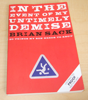
I’m very happy with the design. They incorporated the sign idea that I’d woken up with one morning. That came to me because someone at Harper had voiced the concern that the title might be “too dark.” I was panicked that they might try and change the title, so I was desperate to come up with a visual that would put those fears to rest.
I really like the way the color red screams Achtung! at you. That’s what you want in a cover – something that’s roughly the equivalent of setting a small signal fire over in the corner of the book store. I have no doubts that this design will at the very least cause someone to go, “What the hell is that over there?” And really – getting a potential reader to say, “What the hell is that over there?” is the name of the game as far as I think I understand it.


Brian Sack
I started Banterist in 2003 after this conversation with my cat. It led to all sorts of good things.
You thought up a pretty nifty stick-figure/warning-sign design. Has that been on your website before? Because, I think I’ve seen it, or something like it before, somewhere. It was probably the image in Book Report: The Red Pencil Stage ( http://www.banterist.com/archivefiles/000492.html ).
Best of luck on the book. I hope the design gets someone to say “What the hell is that over there?”
[ The sign you’re referring to was what I put together with my mad Photoshop skills to give the graphics department an example of what I was talkin’ ’bout. -B. ]
A couple of questions:
– When will it be out?
[ May ’08. Seems like forever. -B. ]
– Is there anything in it for people that don’t have kids?
[ Yes, it’s designed to appeal to the child-free as well because a broader audience means a bigger moat. -B. ]
– If a dedicated Banterist reader were to ask exceedingly kindly for an autographed copy, perhaps with some sort of extra illustration or witty insight, would that be possible? Might I add, “very dedicated”? Oh and I live and work in Poland, so this service can’t cost too much.
[ I’ll start working out the logistics of that in Microsoft Excel. -B. ]
Thanks and may the reviews be positive.
Brian, I’m guessing the first thing your “son will need to know” is how to read. Hoping the other 19 things are much funnier (rephrase that: are funny),
Theo