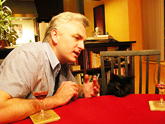
Scene: The guy who owns Pay-O-Matic Check Cashing is seated with Chip, a freelance graphic designer and metrosexual with thick-framed glasses who recently graduated from the School of Visual Arts.
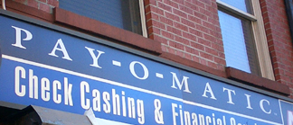
Boss: As you know, Pay-O-Matic is a check-cashing operation. As such, we provide a valuable service to individuals who don’t have a bank account.
Chip: Who the hell doesn’t have a bank account?
Boss: Mainly illegal immigrants, fugitives, felons just out of Rikers, terrorists, deadbeat dads, conspiracy theorists, drug addicts, tax evaders and people who really hate banks.
Chip: Okay.
Boss: We’d like a logo that helps us to connect with our customers, who I’d imagine are mostly unhappy.
Chip: So you want your logo to reach out to those people and say “We know you’re unhappy, we’re the check-cashing place for you.”
Boss: Exactly.
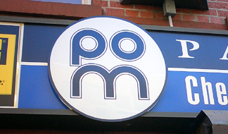
Chip: What if I cram your company’s acronym into a circle, and created a kind of anti-“have a nice day” logo; the “P” will look like an eye crying, and the “M” will look like a grimace – as if the logo itself is in pain.
Boss: Brilliant!

i am laughing out loud, which is odd, since i’m like those sullen customers…unhappy and hate banks.
Boss: And we’ve found that our customers like to picture themselves wearing a monocle, like one of those old-timey ones…..can you fit that into the logo?
Chip: Sure!
Wow, one you will put all of these senseless engergy to a good cause or just jerking off.
The above was pure ignorance.
I would enlighten you why but I have lost interest in my own response and the entertainment of idoits.
THATS NOT VERY NICE. I HAPPEN TO WORK FOR POM, AND IT IS NOT A SLEEZY COMPANY. AND THE BOSSES HAPPEN TO VERY NICE PEOPLE! YOU SHOULDN’T MAKE UNKIND COMMENTS ABOUT PEOPLE OR COMPANIES (EVEN IF IT IS ONLY A JOKE) WHEN YOU DONT REALLY KNOW ANYTHING ABOUT THEM.
PAY O MATIC CORP SUCKS. THEY HAVE THIS GUY WHO RAN THE IT DEPARTMENT… I THINK HIS NAME WAS DICK. OR MAYBE RICK. ANYWAY, HE ROBBED THE JOINT- ELECTRONICALLY DEPOSTED $$ TO HIS ACCOUNT. THAT ARE A BUNCH OF MORONS OVER THERE. DONT DO BUSINESS WITH THESE PEOPLE.
the above statement about Pay-o-Matic is completely false this company is one of the best family ran business in new york they make there employees feel like family not just mere worker I will always hold this company in high esteem
George Thompson
[ George: Grammar & humor workshops. -B.]
so i do work for payomatic and have worked for many years in the check cashing industry.
and i think this article is hilarious. perfect check cashing satire.
awesome !
it looks like a woman and a man standing next to each other…
just my $.02
@EX POM EMPLOYEE… you are right. It was Rick. He stole from them. Real P.O.S.