Banterist talks with Taxi and Limousine Commission’s Kevin Sydney Melton about the newly-designed New York City taxi logo that no one likes.
Why did they decide to change the logo from the old-fashioned stencil to one that no one likes?
While adding a powdered milk-like substance to my coffee in the break room it occurred to me that New Yorkers had lost the feeling of camaraderie we’d all had right after 9/11. I wanted to bring that sense of solidarity back by giving New Yorkers something they could all wholeheartedly agree to despise.
A lot of people are saying “It looks like crap. It’s something I could have come up with by accident.” Was that intentional?
We felt quite strongly that a good design would make graphically-challenged individuals feel bad about themselves. I went to a school that didn’t use grades because they’re divisive and can hurt your feelings. In that same spirit I wanted a logo that anyone – regardless of race, creed or intellectual capacity – would feel they could have designed on a Macintosh SE with a pirated copy of MacPaint.
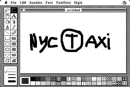
Can you walk us through the design process?
Sure. One of our designers found an old floppy disk from 1989 that had a crude bitmap font still on it. Apparently the original owner of the floppy had hoped to destroy the disk and the crude bitmap font, but failed. So we used it.
What about the T in the circle?
It’s funny how that came about. I was on the phone with a friend from Massachusetts and he said “It’d be wicked awesome if you stole the logo that we use for the mass transit system here in Boston. It’s a T in a circle.” So that’s exactly what we did.
Was the “axi” intentional, or were you hoping that it looked like it belonged to the plagiarized T in the circle?
We were hoping people would see “Taxi” instead of “axi” but then we realized it’s even better this way. When you see “axi” it leaves you wondering what someone must have been thinking. Turns out it’s the same kind of bewilderment you experience when you realize all the cabs are off-duty at 4:30pm – when you need them the most.
So you’re happy with the new New York City taxi logo that no one likes?
From my perspective, yes. It’s like we took a bunch of outdated fonts, stuffed them in a blunderbuss and shot them on the side of a car. As far as I’m concerned it’s a total success.


Oh no! It is a real logo! I read this, thought it was funny (and it is), then I found that it is the real new logo on the NYC website. What is wrong with NYC!? Was it equal opportunity day at the logo designer place? Did they all go out for drinks and leave a retard in charge of designing it? I can’t believe the TLC council approved this atrocity! Wow! I’m glad I don’t leave in New York.
I can’t believe you actually have a Mac SE with a pirated copy of MacPaint. I’m calling the Business Software Alliance. Wait, on second thought, they probably won’t care.
[ They do care – if I remember the absolutely, outrageously horrendous radio commercials they ran in 1999 correctly. -B. ]
Now we see the downside to “Bring Your Daughter to Work” day.
personally Im glad you “leave” in NYC as well
I like it. I didn’t used to, but it has grown on me. I live in NYC.
I for one love the new look… from an advertising POV, it’s perfect… the very fact that it’s so varied is what draws your eyes to it, and that is the goal of any marketing effort… to get you to notice the product.
BTW, I would love to know the name of that crude bitmap font you used for the NYC.